text_fields Typography
- A type scale is a hierarchy of type styles.
- The Material Design type scale can be customized for different needs.
- Font pairings can help readers understand what they're reading.
Overline
Headline 4
Caption
This paragraph is using the Body 2 style. However, this was anything but a regular bee: in fact it was an elephant.
Subtitle 2
This paragraph is using the Body 1 style. She caught the shawl as she spoke, and looked about for the owner: in another moment the White Queen came running wildly through the wood, with both arms stretched out wide, as if she were flying.
code Typography activity
Learn how to generate a typescale by adding a font from Google Fonts, then customize specific type styles, like the Body 1 type style.
A. Add a Google Font to your Material Theme
Change your Material Typography using standard sizes and weights at each point on the scale.
1
Choose a font from Google Fonts
Browse Google Fonts to find a font that expresses your brand or app’s function. When you have found one that seems appropriate, use the red add_circle_outline button to add it to the collection drawer.
★ Design Tip
Choosing a font can be hard, especially with all of these choices available on Google Fonts. When in doubt, go simple, and try different styles. Read more about choosing fonts on Google Design.
2
Add the 300, 400 and 500 weights of your selected font
The Material Typography scale uses a range of weights for different styles: 300, 400 and 500. To see if your font you selected has these weights, click on the CUSTOMIZE button. If these weights are available for your font, check 300, 400 and 500.
If your font doesn't have these weights available, skip this step.

3
Import the font into your Material Theme SCSS file
Once you add a font to your collection, and customized the selected weights, Google Fonts will display the URL in the EMBED tab.
Click on the @IMPORT button, then copy & paste the @import statement to the top of your
project's my-theme.scss file. Use the code snippet below as a guide.
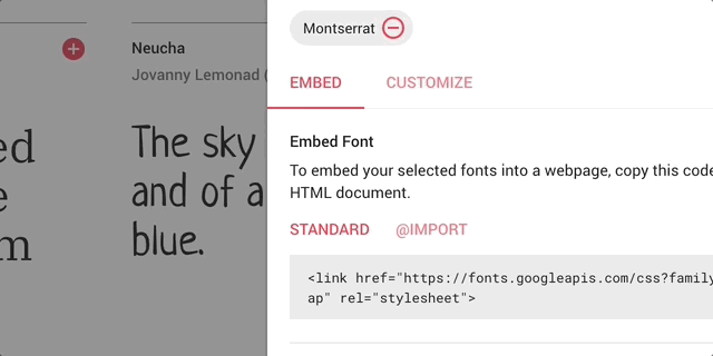
@import url('https://fonts.googleapis.com/css?family=Roboto'); // Select your own font
3
Apply the font to your components
Now that you have imported the font into your project, set that font to be the value of the
$mdc-typography-font-family variable in the my-theme.scss file.
Make sure to wrap the font name is in unquote() so it is compatible with all components.
Note that it's fine to include spaces if the name of your font has more than one word!
$mdc-typography-font-family: unquote('Roboto'); // Use your own value check Part A Complete
Check out the templates to see see how the font you chose scales across various components.
B. Customize specific type styles with mixins
In this step you will customize three type styles: Headline 4, Body, and Overline.
1
Customize the Headline 4 style
Headlines are the largest text on the screen, reserved for short, important text or numerals.
Let's set the Headline 4 style to be bold and italic.
Copy and paste the following code snippet into your my-theme.scss file under the Typography Activity section.
$mdc-typography-styles-headline4: (
  font-weight: 800,
  font-style: italic
);
2
Customize the Body 1 style
Body text is styled using Body 1 or Body 2.
It’s used for long-form writing and small text sizes.
Let's increase the size of Body 1 text.
Copy and paste the following code snippet into your my-theme.scss file.
$mdc-typography-styles-body1: (
  font-size: 20px
);
★ Design Tip
Learn more about text styling with CSS here.
3
Customize the Overline style
Caption and Overline text are the smallest font sizes.
They are used sparingly to annotate imagery or to introduce a headline.
Let's draw more attention to overline text by setting it to use the Secondary color.
Copy and paste the following code snippet into your my-theme.scss file.
$mdc-typography-styles-overline: (
  color: $mdc-theme-secondary
);
check Part B Complete
Check out the templates to see see how your typography styles are applied across various components.
C. Add another font using Google Font pairings
Material Theming makes it easy to use an additional font in your project’s typography scale. We'll use a Google Fonts pairing to choose a supplemental font and apply it to your project’s body text.
1
Find a pairing for your font by going to its specimen page on Google Fonts
A font’s specimen page includes a list of pairings curated by Google Fonts. Choose one you enjoy and add it to your collection using the red add_circle_outline button.
2
Import the font into your Material Theme SCSS file
Similar to Part A, click on the @IMPORT button, then copy & paste the @import
statement to the top of your project's my-theme.scss file, right under the
@import statement for your first font.
@import url('https://fonts.googleapis.com/css?family=Montserrat'); // Select your own font
3
Customize the Body 1 style to use the new font
Material Theming makes it easy to customize one specific level of your type scale with mixins.
Similar to Part B, we can customize the Body 1 style to use the new font.
Copy the following code snippet to replace the $mdc-typography-styles-body1 you entered in the my-theme.scss file in Part B.
$mdc-typography-styles-body1: (
  font-family: unquote('Montserrat'), // Use your own value
  font-size: 16px,
);
check Part C Complete
Check out the templates to see see how the typography changes you've made are applied across the various components.
Typography theming presets
The beauty of Material Theming is its ability to achieve vastly different visual results just by changing a few lines of code. Try out the fonts of these presets to see how they change the look and feel of your project.
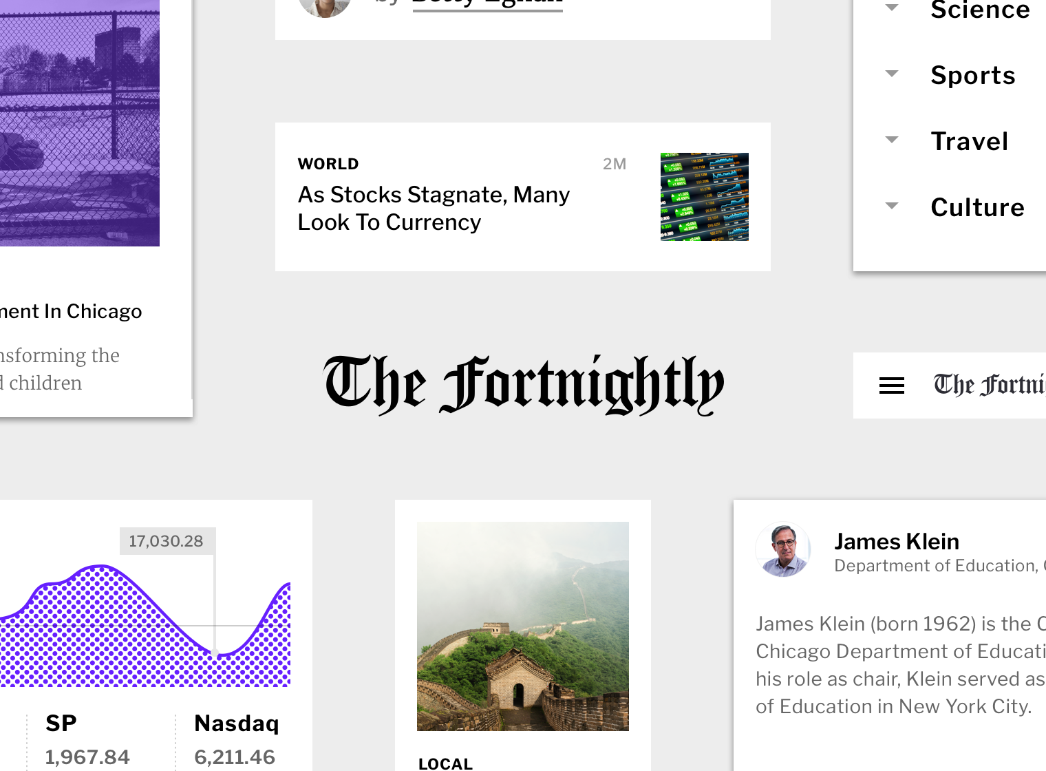
Editorial-friendly font
Fortnightly is a news app that covers a variety of topics. One of its fonts is Libre Franklin, a sans serif typeface inspired by Franklin Gothic. This font is easily scannable, and its various weights help establish the app's typographic hierarchy.
@import url('https://fonts.googleapis.com/css?family=Libre+Franklin:300,400,500');
$mdc-typography-font-family: unquote('Libre Franklin');
Quirky, character-filled font
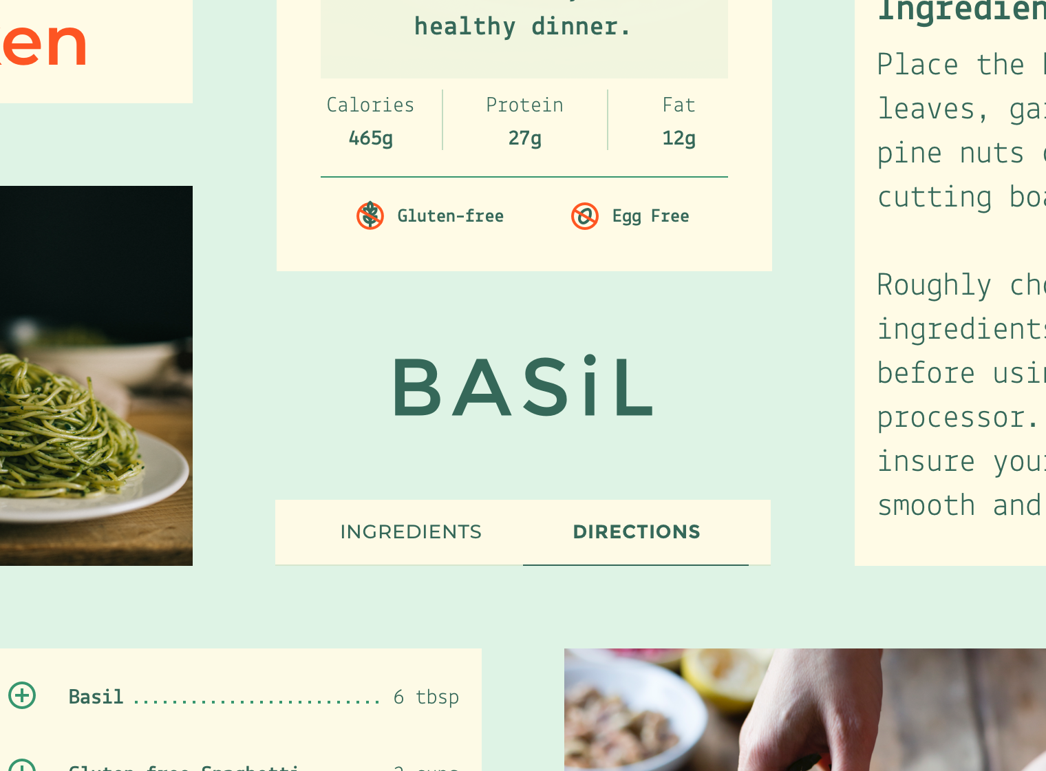
Basil is a recipe app allowing users to browse recipes curated by a group of chefs and bartenders. Basil uses the font Montserrat as a display typeface, as well as for body, caption, and button text. Montserrat is a sans serif font with wide letterforms.
@import url('https://fonts.googleapis.com/css?family=Montserrat:300,400,500');
$mdc-typography-font-family: unquote('Montserrat');