border_style Shape
- Shape can create visual hierarchy among components.
- Shape can express brand and imply interactivity.
- Shape families unify related shapes across all components.
Small |
Small Components
|
Medium |
Medium Components
|
Large |
Large Components
|
Overline
Headline 6
code Shape activity
Learn how to customize the shape of small, medium, and large components, and apply them to your theme. Then learn how to customize a single component’s shape without affecting other components.
A. Customize your shape scheme
It's easy to change the shape of multiple components using three variables. In Step A, you will use those variables to adjust the shape of small, medium, and large components. You'll also create a harmonious shape system by understanding the relationship between component shapes.
1
Customize small components
To change the shape of small components such as buttons and text fields, update the $mdc-shape-small-component-radius variable.
Paste the following snippet into my-theme.scss file to give these small components a radius of 2 pixels.
$mdc-shape-small-component-radius: 2px;
2
Customize medium components
To change the shape of medium components such as cards and dialogs, update the $mdc-shape-medium-component-radius variable.
Paste the following snippet into my-theme.scss file to give medium components a radius of 32 pixels.
$mdc-shape-medium-component-radius: 32px;
3
Customize large components
To change the shape of large components such as navigation drawers, update the $mdc-shape-large-component-radius variable.
Paste the following snippet into my-theme.scss file to give large components a radius of 140 pixels.
$mdc-shape-large-component-radius: 140px;check Part A Complete
Check out the live prototype and templates to see how your shape scheme has cascaded throughout components. Be sure to tap the menu icon in the top app bar to see how the shape of the navigation drawer has been updated. Some components may look strange, but you will be refining this in the next step.
B. Refine your shape system
In Step A, you customized the shape of components using provided values. But these values were exaggerated and incorrect. Check out the templates and you'll see how these values create an incohesive shape scheme.
For example, the shape of the button interferes with the shape of the card.
In Step B, you'll create a cohesive shape system using your own values.
1
Generate a refined shape scheme using your own values
Update the three SCSS variables in the my-theme.scss file to create a cohesive shape system with your own values.
Use the following code snippet as a guide.
$mdc-shape-small-component-radius: 8px; // Use your own value
$mdc-shape-medium-component-radius: 16px; // Use your own value
$mdc-shape-large-component-radius: 4px; // Use your own value
★ Design Tip
Deciding on shape values can be challenging. It’s best to start out with simple, small shape values like 4px, 8px, 16px or 24px. Then work up to larger or more complex shapes, such as alternating radii (4px 12px) or manipulating a single corner (4px 16px 4px 4px).
check Part B Complete
Check out the templates to see how your shape system has cascaded throughout your components.
C. Customize a single component’s shape
In Steps A and B, you customized multiple components at once using Material Theming variables. For Step C, you'll customize the shape of a single component (a button) using that component's shape mixin.
1
Customize the button component’s shape
In the my-components.scss file, find the selector for the .mdc-button class.
Copy and paste the code snippet below to change the button component’s shape to 20px,
overriding the radius value of your shape scheme’s small components.
.mdc-button {
  @include mdc-button-shape-radius(20px);
}
check Part C Complete
Check out the Material Template to see how your shape scheme has cascaded throughout components.
Shape theming presets
The beauty of Material Theming is its ability to achieve vastly different visual results just by changing a few lines of code. Try out the shapes of these presets to see how they change the look and feel of your project.
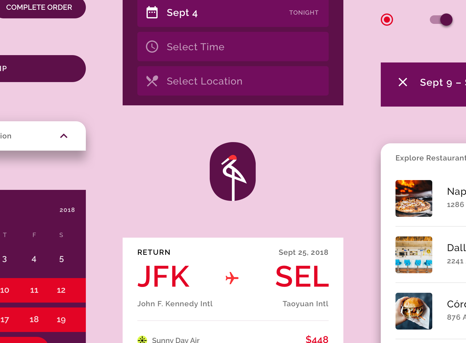
Rounded shapes
Crane is a travel app that helps users find and book travel, lodging, and restaurant options that match their input preferences. Its small components have rounded corners with a 4-pixel corner radius, but the button component overrides this value with a 50% corner radius. Its medium components have a 16-pixel corner radius, and large components have a 20-pixel corner radius.
$mdc-shape-small-component-radius: 4px;
$mdc-shape-medium-component-radius: 16px;
$mdc-shape-large-component-radius: 20px;.mdc-button {
@include mdc-button-shape-radius(50%);
}Sharp shapes
Fortnightly is a news app that covers a variety of topics. The app’s focus is on content, and all of its components have a corner radius of 0 pixels.
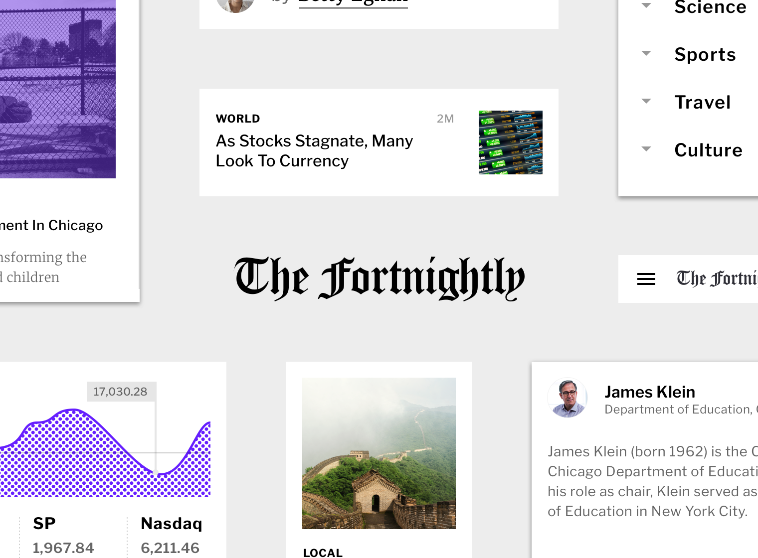
$mdc-shape-small-component-radius: 0px;
$mdc-shape-medium-component-radius: 0px;
$mdc-shape-large-component-radius: 0px;